

SweetSpot.
ROLE
End-to-end UX/UI Designer
TOOLS
Figma, Figjam, Canva
DURATION
6 weeks

Background:
In today's fast-paced world, maintaining mental well-being is essential. The daily commotion of life makes it difficult for one to carve out time for their mental and emotional health.
Challenges:
Creating a personalized meditation experience that streamlines the journey for the users looking to develop a meditation practice, reducing the time and effort required. I aimed to prevent the user from being overwhelmed by choice selection.
Problem:
One of the biggest problems with meditation apps for users is sustained engagement and motivation. While meditation apps offer various benefits, the user often faces several challenges that can hinder their long-term use and progress:


Research
Objectives
Identify the factors that hinder users from maintaining a consistent meditation practice.
Explore the motivations that drive users to stay consistent when adopting something new.
Gain insight into users’ goals and well-being.
Examine the influence of business ethics on consumer behavior.
Competitive Analysis
Meditation apps are everywhere, but what makes them different is what they specialize in. I had some important questions: Which are the top meditation platforms? What do they mainly focus on, and who uses them? Finding answers to these questions could help me create something different in this market. I also wanted to understand how they keep users interested and what features they use. Most importantly, I wanted to study the features and design of other meditation apps to see if they work well and if there are any opportunities for improvement.
I took a close look at three popular platforms: Calm, Headspace, and Insight Timer. For each one, I listed what they offer and what the advantages/disadvantages are. What I found was that Calm is known for its sleep and relaxation features, Headspace is famous for expert-led meditation sessions, and Insight Timer stands out because it's all about building a community of users. What they all had in common was a not-so-intuitive task flow due to the amount of features each platform offered.
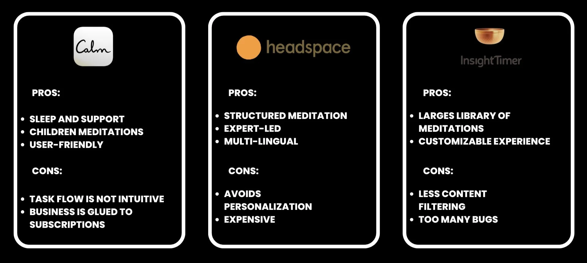
Common Limitations
Lack of personalization
2. Challenging to access meditations swiftly
3. Not suitable for busy individuals
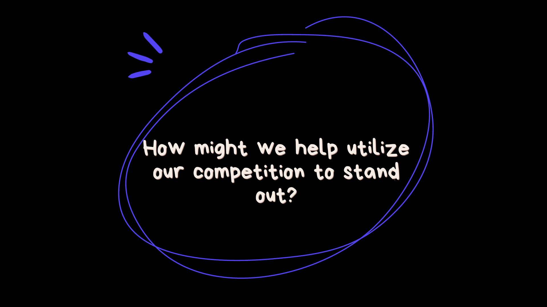
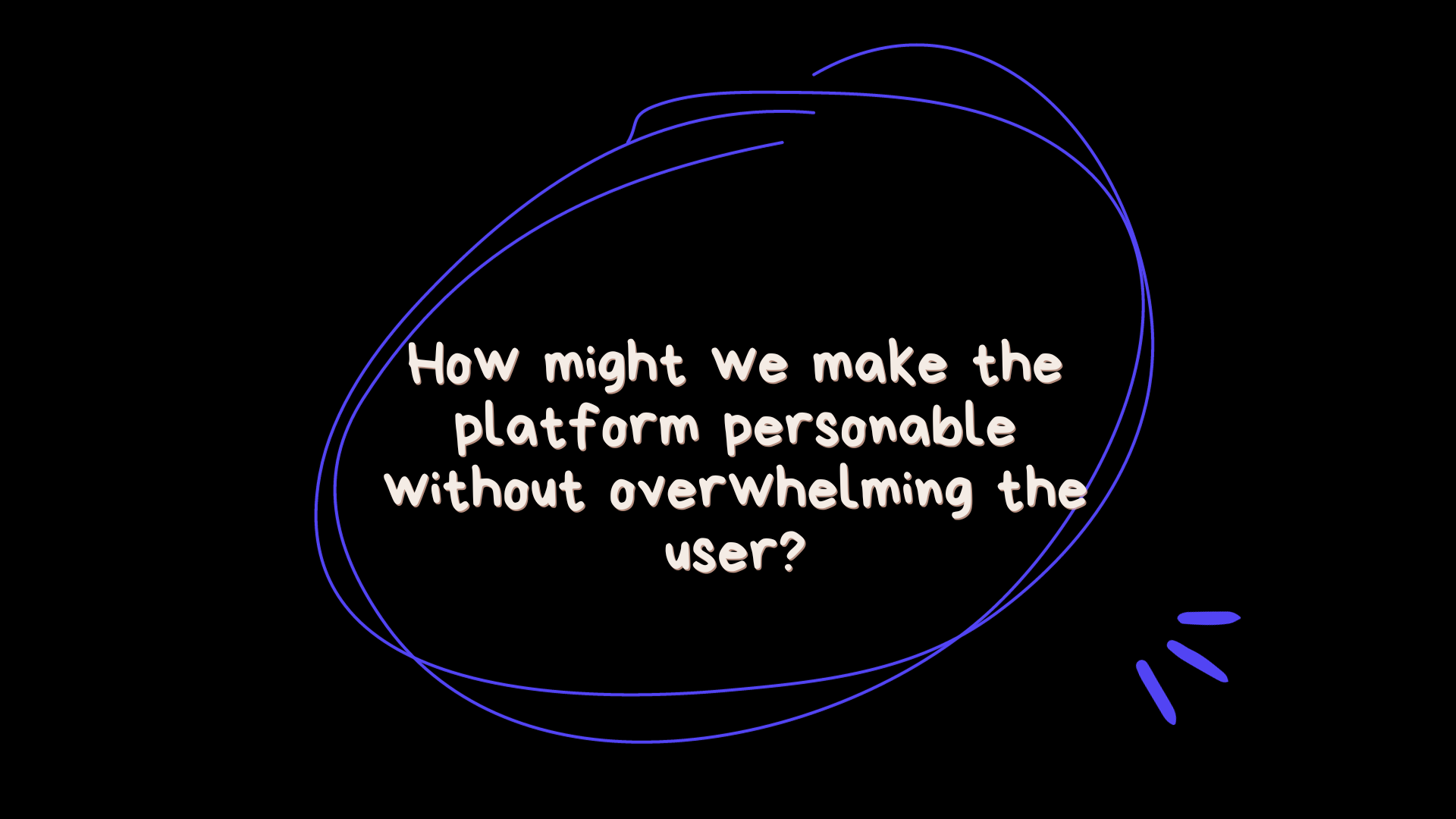
To gain a deeper understanding of the data I gathered, I decided it would be appropriate to organize my thoughts by converting them into structured "How Might We" questions. This step was crucial in order to transform the idea in my mind into a tangible product, as it allowed me to outline my users' pain points, gains, and needs.
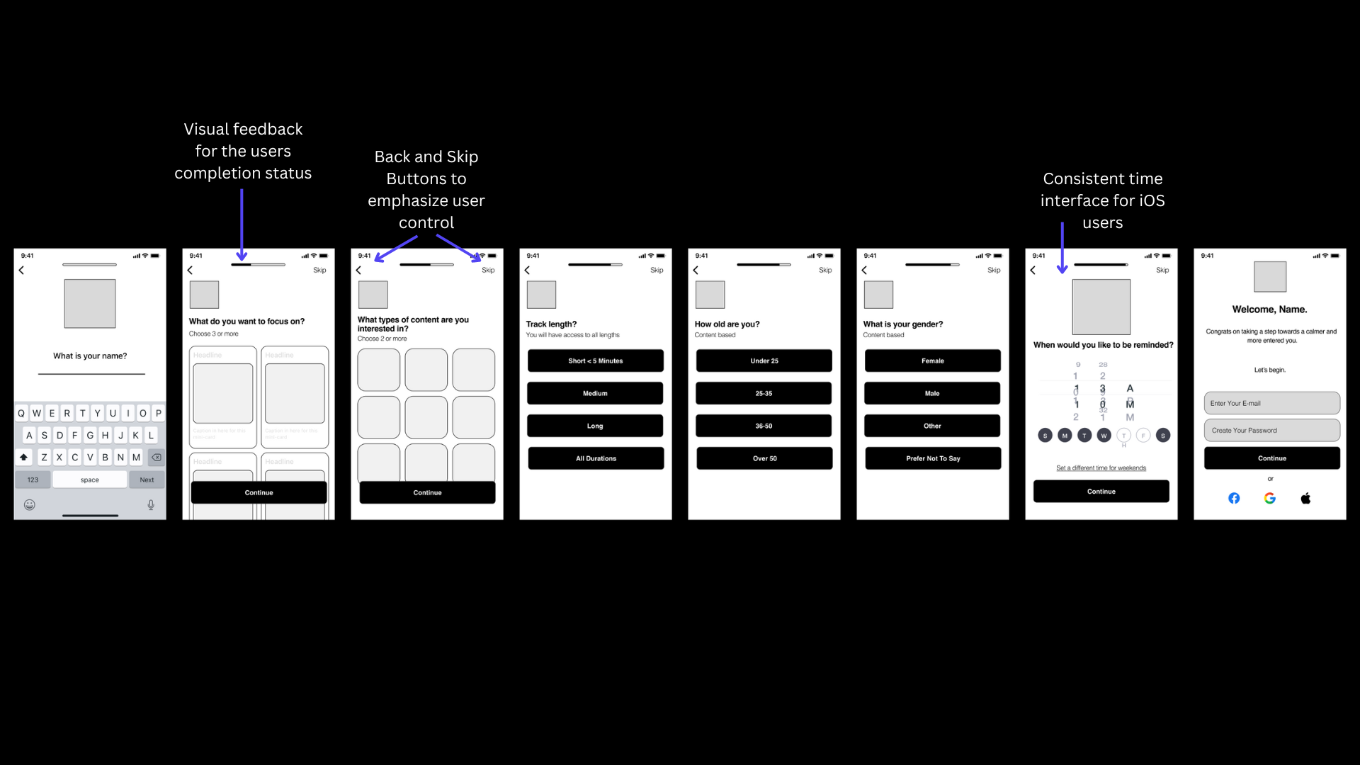
At this point in time, I had recognized what features should be included in my app. However, the next step was to bring my ideas to life through visualization. Unlike many designers, My approach to wireframing involves diving directly into Figma to create rough outlines and sketches of my concepts. This is where I make tons of iterations and keep everything organized onto one “artboard”. This approach has simplified the process compared to sketching on a piece of paper and transferring it into Figma.
The primary challenge I faced was the tendency to overthink each step or screen. I aimed to avoid repeating the same mistakes as other meditation platforms that overloaded their apps with excessive features. My goal was to keep my app simple and provide users with the results they initially sought as soon as they joined. This led me to conceive the idea of implementing a survey at the beginning of the app. The questionnaire would serve to personalize the user's experience based on their responses, influencing the app's structure, meditation types, and style accordingly. This way, users wouldn't have to spend time navigating through a vast library of meditations, eliminating the need for excessive thought and simplifying their journey to improving their mental and emotional health.
During this design phase, I contemplated the most efficient way for users to go from downloading the app to initiating their first meditation session. To enhance my comprehension, I constructed a user and task flow diagram to visualize the various paths users could take. I also took into account the potential limitations or frustrations users might face and evaluated how quickly they could finish the onboarding survey.
Design & Iteration

User Flow

Task Flow
UI/Branding
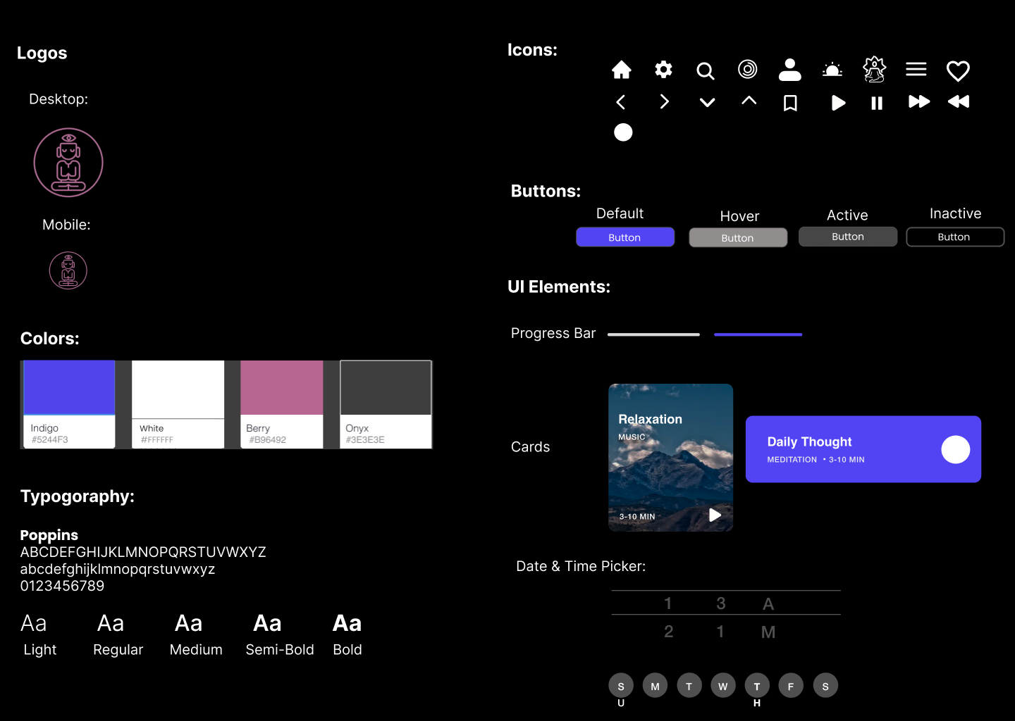
SweetSpot is named after the the feeling of the meditator being the space between each thought. The intention was to offer users an initial experience that hints at the possibility of balancing their busy lives with the inner peace within. Given life's constant whirl of thoughts and obligations, the design aims to evoke calmness and relaxation.
The choice of indigo as the primary style was deliberate, symbolizing the third-eye chakra and intuitive energy while fostering focus. Placing indigo on a dark background not only creates a visually striking contrast but also reduces strain on the user's eyes. Furthermore, the UI elements were designed to be familiar, ensuring cohesive and inclusive iconography for all user demographics.
This journey has been incredibly fulfilling. It started as a vague idea, a wish for others to meditate and enhance their mental and emotional well-being, lacking clear direction. Reflecting on it now, this path has been quite lengthy. Nonetheless, I feel grateful for all of the knowledge I've gained throughout this experience and the chance to design a product that could potentially help many individuals on their journey to self-improvement.
I take pride in this project because it marked my first venture into identifying user problems and generating design solutions to address them. This journey allowed me to recognize my natural inclination toward UI design and the critical role consistency plays in a product's success. I'm excited to continue learning and improving this skill in my future projects, and to add more skills to my design toolkit.